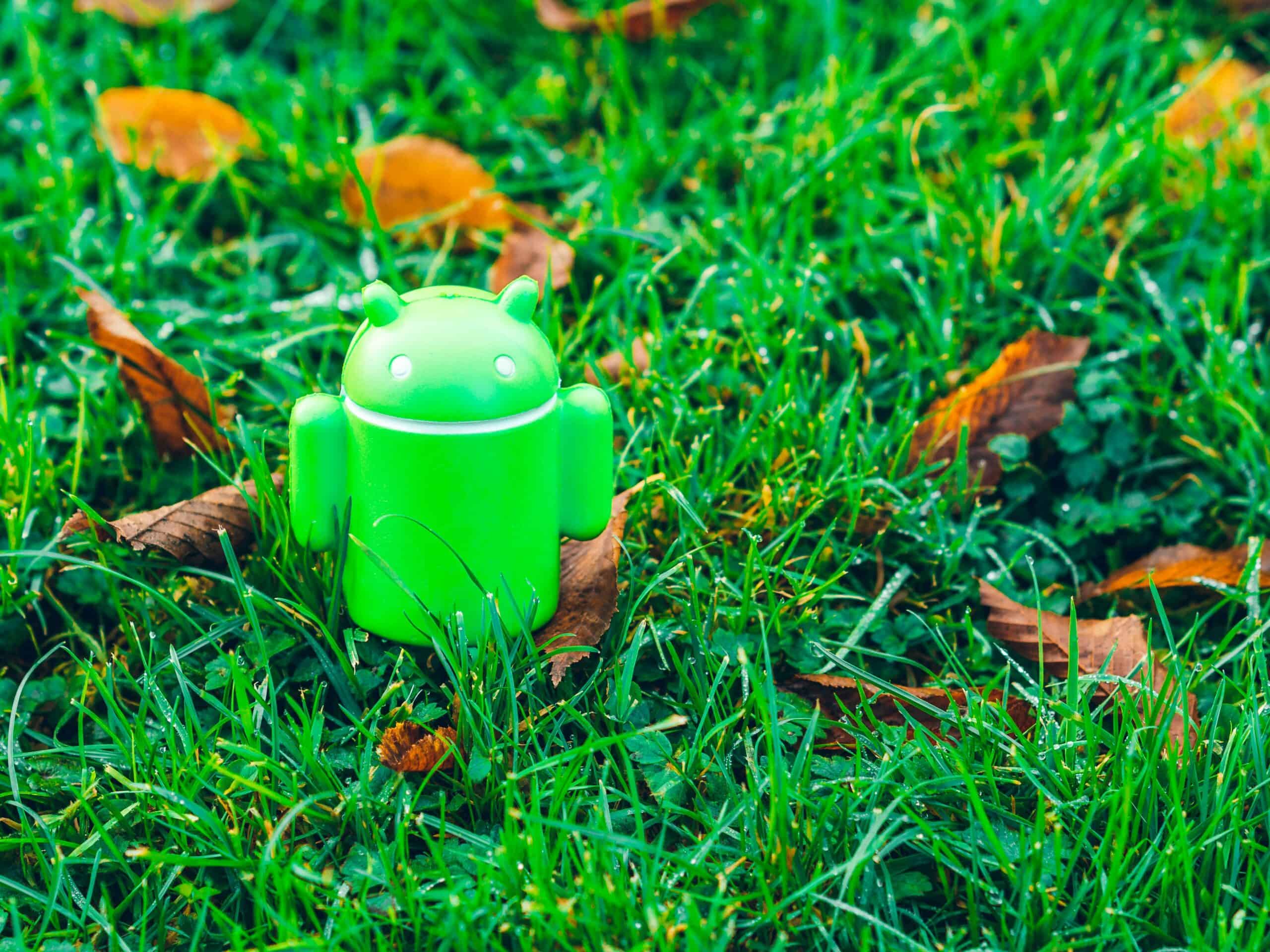
Google has quietly rolled out Android 16, and while the release wasn’t flashy, the features are making a loud statement. With the introduction of Material 3 Expressive, Android has received a complete visual and functional makeover. From revamped animations to funky fonts and deeper personalization, this is arguably one of the biggest updates Android has seen in years.
In this blog, we’ll explore all the exciting changes in Android 16, how it draws inspiration from iOS and Samsung’s One UI, and when you can expect to see these updates on your phone.
🎯 A Whole New Vibe – Vibrations & Animations Overhauled
Earlier, Android’s haptic feedback felt more robotic – just a sharp buzz here and there. Now, vibrations feel much smoother and intentional. The entire motion system has been reengineered. Buttons and touches come with shape-morphing animations — the UI feels alive.
Tapping on a button? Now it doesn’t just respond — it reacts, morphs, and bounces in fun, fluid ways. Even flashlight toggles feel like a mini light show.
🎨 Material 3 Expressive – Colors, Fonts, and Funk
This update brings a bolder, brighter design language. Think expressive fonts, vibrant colors, and a “Shanji vibe” — stylish yet playful. Google usually avoids font changes, but Android 16 breaks that norm with new, funkier typography across the system.
It’s not just about looking good — the animations and transitions feel personalized based on your photos, wallpaper, and mood. Yes, it’s that deep.
📱 iOS & One UI Inspirations — Copy or Collaboration?
Let’s be honest — many of these Android 16 features feel familiar. Quick settings icons? The blur effects? The new animations and gestures? They scream iOS vibes. But is it copying? Maybe. Or maybe it’s just mutual inspiration — like Google and Apple borrowing each other’s clothes.
Either way, the user benefits. And it’s not new — Android has a long history of adopting popular features from custom ROMs and other ecosystems.
⚙️ Quick Settings Overhaul (But Some Confusing Steps)
The Quick Settings panel now looks completely different — softer shapes, new icons, and added blur effects. However, some decisions may feel odd. For example, turning on mobile data is now a multi-step process:
- Tap Wi-Fi
- Turn off Wi-Fi
- Then mobile data appears to turn on
Something that used to be one tap now takes four. Let’s hope this gets streamlined.
📷 Google Photos & Alarm App – Complete Redesign
Google has redesigned key apps like Google Photos and the Clock/Alarm app. Photos now look eerily similar to iOS’s gallery — organized, clean, and modern. This change is significant because most Android users rely on Google Photos as their main gallery app.
The Alarm app also looks completely different, with animations and UI elements that make waking up slightly more pleasant.
🤖 Gemini Integration – AI Just Got Smarter
The Gemini AI assistant is now more deeply integrated, not just into smartphones, but across smartwatches and smart TVs. You can now ask Gemini questions like:
“Hey Gemini, which camera is this?”
And it’ll respond with intelligent guesses like “Sony FX3” (with some margin for error, of course).
It’s designed to help you identify products, order from apps, or even understand foreign menu items while traveling.
🌌 Dynamic Wallpapers & Always-On Progress Indicators
Fresh wallpapers? Of course. With such a big redesign, Google is also bringing new dynamic wallpapers.
And just like iOS and Samsung phones, progress indicators are now natively integrated. You’ll see them on the lock screen, always-on display, and within apps like food delivery or shopping.
🔍 Microscopic Changes That Matter
Small touches include:
- Touch feedback animations on every interaction
- Bubble-like effects while swiping notifications
- Recent apps menu has a bounce-back animation
- Blurs everywhere – something Android previously avoided
- Overall, everything feels more fluid, playful, and modern
📅 When Will You Get Android 16?
While Android 16 is technically released now as a developer beta, it’s not recommended for regular users due to bugs and instability.
Here’s the expected rollout:
- Public beta: Likely starting around May 20-21 during Google’s main I/O event
- Stable version: Expected around early June, though delays are always possible
- Full rollout: Will take months to reach most devices, especially non-Pixel phones
If you use stock Android (e.g., on Motorola, Nothing, or Pixel), your phone will likely be among the first to get the full Material 3 Expressive experience.
🧠 Final Thoughts
Android 16 is a bold step forward — and while many features feel “inspired” by others, the final experience is unique, fun, and personal. From colors to AI, from animations to app design — your phone will feel brand new.
Are you excited for Android 16? Let us know in the comments which feature you liked the most — or which one feels like cheating! 😄

Leave a Reply